Impactfully sharing your brand refresh
Just like people, brands inevitably evolve and grow - their services, purpose and audience can shift and change. With that in mind, branding must also evolve in harmony with a brand, expanding to meet its emerging needs. As what worked for a brand at the beginning may no longer serve them further down the road. When a brand outgrows its branding it’s time for a refresh, a process that allows a brand to reimagine it’s own image, to accurately reflect the values, direction and aesthetics of the business in this present moment and looking forward to the future.
Today’s post is for those who have recently refreshed their branding and are curious to know how best to manage the transition from old to new. It may also answer a few questions for those considering a brand refresh, who would like to know a little about the process and benefits.
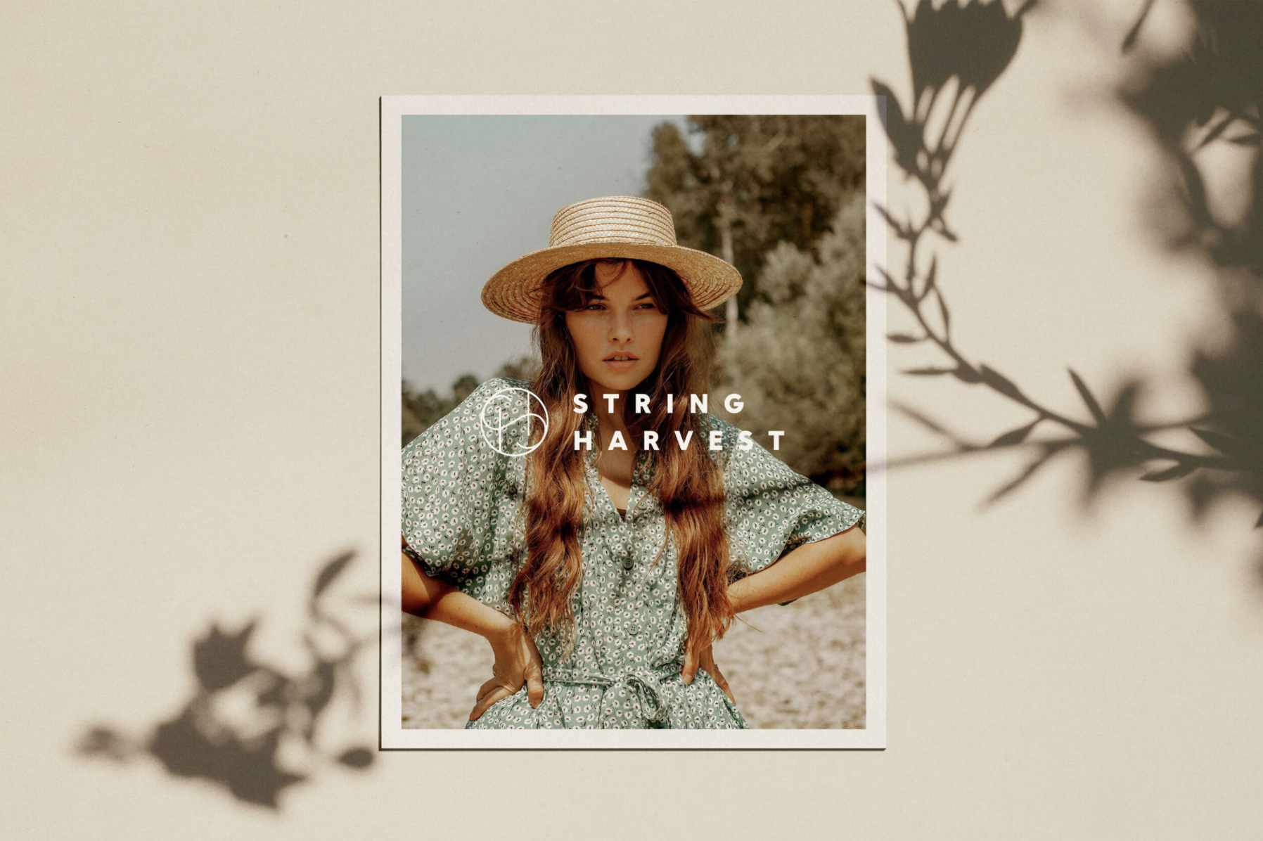
We’ve included a short insightful interview with creative business owners Jo Olive - of the beautiful letterpress brand ‘Jo Olive’ and Cass Harris - owner of ‘String Harvest’ the leading natural fibres store, about what motivated them to refresh their own brands and what they got out of the experience.
Let’s begin with a few steps to make sure your brand refresh creates the impact it deserves. We know how hard you’ve worked to re envision your brand and we want to help you make the most of it!
Today’s post is for those who have recently refreshed their branding and are curious to know how best to manage the transition from old to new. It may also answer a few questions for those considering a brand refresh, who would like to know a little about the process and benefits.
We’ve included a short insightful interview with creative business owners Jo Olive - of the beautiful letterpress brand ‘Jo Olive’ and Cass Harris - owner of ‘String Harvest’ the leading natural fibres store, about what motivated them to refresh their own brands and what they got out of the experience.
Let’s begin with a few steps to make sure your brand refresh creates the impact it deserves. We know how hard you’ve worked to re envision your brand and we want to help you make the most of it!
01 | It helps to be prepared
WEB
- email addresses / signatures
- domain names
- website logo
- website design
- website imagery
- email addresses / signatures
- domain names
- website logo
- website design
- website imagery
SOCIAL
- handles
- profile pics
- bios
- hashtags
- handles
- profile pics
- bios
- hashtags
MARKETING
- brand style guide
- newsletter templates
- promotional materials
- brand style guide
- newsletter templates
- promotional materials
PRINT
- business cards
- postcards
- labels
- swing tags
- packaging
- business cards
- postcards
- labels
- swing tags
- packaging
02 | Consistency is key
Before you roll-out your refresh, It’s important to have all your rebranded assets available, so that print, web and socials are all updated and ready at your fingertips. This way the process will flow easily and you won’t find yourself using old branding while you wait for the new to become available. Inconsistency between the use of old and new branding can confuse your audience and dilutes the overall impact of your refresh. You want every touch point of your brand to be updated and unified, from handing out your stunning new business cards to posting from your radiant rebranded social pages.
03 | Share your story
The refreshing of a brand is an exciting time, it’s a great moment to reconnect with your community and bring them up to speed about your new direction and ideas for the future. Thanks to your refresh you will have a suite of new visuals and stories to share. Revealing a few key steps in the creation of your new branding can really engage your audience and act as a small campaign in the lead up to its release. Showing a little behind the scenes of your new branding is a great way to introduce your new look and let your audience appreciate how you arrived there. Perhaps you might like to share mood boards, or a colour palette, some design elements such as type, photography or illustration. Think of these posts as teaser trailers for your big brand reveal!
04 | Use that energy
Once you’ve released your sparkling new branding into the world, use that vibrant energy to welcome your audience into your brand and or space, to either remind them of your services or to alert them to your new offerings. A post on your socials of your lovely products in their new branding or freshly painted new signage can really reignite your audience’s passion for your brand. You could even consider holding an event in your space to celebrate this new chapter of your brand, or if your business is online perhaps a limited release of products could be the perfect way to show off your new branding.
05 | Do things by the book
Change always takes time to get used to, so whilst you are in the early stages of your brand refresh it’s important to stick to your new brand guidelines like glue. This will help you feel grounded during this time of transition, it will give you clarity and boundaries so you can be confident you’re staying true to your new branding. A lot of thought goes into creating brand guidelines, each expression of your brand is considered. Decisions on type, colour, imagery, composition, brand voice and tone have all been made to showcase your brand in the best way possible. So make the most of this essential tool and refer to it often.
Now let’s hear from two inspiring business owners who recognised the need to refresh their unique creative brands. We asked Jo and Cass to share a little of their own stories, because here at Puraest we believe sharing experience and knowledge is key to building a successful brand. There is so much we can learn from one another when it comes to running a business and the advice of someone who has forged their own path is invaluable.
Thanks so much to Jo Olive and Cass Harris for generously sharing their insights and experiences below, we hope today’s blog has helped to unpack a little of the mystery surrounding rebranding. If this post has you pondering your own brand refresh we’d love to hear from you, refreshing brands is a privilege we treasure here at Puraest.
Jo Olive - Jo Olive ( Letterpress & Creative Studio )
Why did you embark on a brand refresh?
I embarked on a brand refresh because I had just recently spent some time considering my future path. I had been the co-founder of Olive Letterpress for 10 years with my husband, and after some soul searching, had arrived at a place in which I was keen to strike out on my own and explore my own creative voice away from custom work. I have always been the resourceful type who felt I could put together a pretty solid branding for both myself and my former studio, but I felt pulled to let someone else respond to my work with fresh eyes and a new perspective. As someone who has always worn every hat in the studio, letting go of the reins was difficult at first but the rewards were high.
Essentially I wanted an objective view of what I did, I wanted someone I trusted to weave their own magic in response to my work. I wanted something timeless and classic and I wanted the flexibility to use all of the branding elements in a variety of ways. What I wanted most of all was a sense of continuity and consistency - one of my downfalls, as I was always changing my "logo" or "branding" or colour palette at a whim.
I felt that a brand refresh would also level things up, to create a presence that was professional and trustworthy and a reflection of the quality, care and labour that goes into every piece that comes out of the studio.
What did you get out of the brand refresh?
Not only did I receive the most obvious aspects, a beautiful suite of assets to use for my studio, but I also felt that I forged a great partnership with Anna, one that I could return to again and again in the future for any aspect of my branding or future projects. By having a definitive style across my social media, website and communications I was now able to save myself considerable amounts of time, there was now no need to reinvent the wheel, tweak anything or make any new decisions about colour, placement or font. Having professional assets also increased my confidence greatly, I didn't have that slight "cringe factor" when I was sending people to my website or introducing new stockists to my work. Like good clothes, my branding helped me to present myself in an authentic way that I was proud of - it makes you sit up straight and walk tall in a way! My branding communicates so much about my work and who I am as a Maker and Artist, even before the customer encounters my work. It instills a level of trust and expectation that can only be good for sales and repeat purchases. Even as my practice evolves and changes over time, I feel confident that I will be able to make use of all of the elements I have to represent who I am and what I do.
Cass Harris - String Harvest ( natural fibres store )
Why did you embark on a brand refresh?
Reflecting our growth - I had been working with a logo, what I'd call a 'temporary fix' logo for a few years. When I first started the brand, I had a logo made by a graphic designer that was partly handwritten and after a while it soon felt a little dated, or perhaps a bit too 'familiar' in style - it had a submark/device which was essentially a lot of circles, denoting the 'string' feeling - but I had began to notice very similar designs popping up in other fibre arts related organisations and brands and I knew that soon enough I would want to create something a little more distinguished.
Functional design - The old logo was vertical, and given we are an ecommerce website first and foremost, I really wanted a horizontal logo. Around 2018-19 I tweaked the logo to remove the handwritten 'string' component and that left us with a fairly clean, unfussed logo. As much as I was tired of this old design, I did still love it, and I will always love the brand name - String Harvest. So I had never envisioned a radical departure from the old look - but it definitely needed some designing, moving forward.
Being 'here to stay' - As we were growing, I ultimately wanted a logo that was designed by a designer (rather than being reminded daily of my stop-gap logo) and the rest came down to timing and budget. During the middle of 2020 and the pandemic, I had moved out of my small shop space and into a much larger warehouse / studio space. It was a big change, both for the business and for me personally. By September I was looking to reopen the retail space and launch several new products - so the time was perfect for a rebrand that came into the world at the same time as opening the space with new signage, and in a way, 're-emerging' from the pandemic. At least - that is how it felt at the time! It was warm and sunny, and the creative process of working through a brand refresh with Anna helped reaffirm to me that I was on the right track with all the changes we'd made over the past year.
Practical reasons + packaging - I shouldn't forget to mention that it was really important to me that whatever our design solution was, it was going to be easy for us to work with in house. One of the reasons I approached Anna was that I wanted the deliverables in canva. We make a lot of small run products and that means we end up creating a lot of labels and product wraps. Being able to quickly edit and print has cut down so much in-house admin time and allows our staff to quickly edit and print labels as needed without needing to use bigger proprietary design suites.
What did you get out of the brand refresh?
Quality. Firstly - I think there really is value in a brand design that is not something you've whipped up yourself. When you are small, I think it's OK to bootstrap what you have to and do what you can, but I value good looking things, and a logo/brand is no exception! I really valued the input of someone who could see the passion that goes into your business, and give it that aesthetic that is solid, that you stand behind. I got a really professional brand image out of the refresh.
A guide - not only did I get a new logo, I had a style guide and a colour palette. It was the constraints I never had before, that I needed. It means the colours we use across the website and social media are not up for invention every time!
Easy to edit labels - Puraest gave us more than a logo, we also have easily editable product wraps and packaging solutions we can create and print ourselves
Why did you embark on a brand refresh?
I embarked on a brand refresh because I had just recently spent some time considering my future path. I had been the co-founder of Olive Letterpress for 10 years with my husband, and after some soul searching, had arrived at a place in which I was keen to strike out on my own and explore my own creative voice away from custom work. I have always been the resourceful type who felt I could put together a pretty solid branding for both myself and my former studio, but I felt pulled to let someone else respond to my work with fresh eyes and a new perspective. As someone who has always worn every hat in the studio, letting go of the reins was difficult at first but the rewards were high.
Essentially I wanted an objective view of what I did, I wanted someone I trusted to weave their own magic in response to my work. I wanted something timeless and classic and I wanted the flexibility to use all of the branding elements in a variety of ways. What I wanted most of all was a sense of continuity and consistency - one of my downfalls, as I was always changing my "logo" or "branding" or colour palette at a whim.
I felt that a brand refresh would also level things up, to create a presence that was professional and trustworthy and a reflection of the quality, care and labour that goes into every piece that comes out of the studio.
What did you get out of the brand refresh?
Not only did I receive the most obvious aspects, a beautiful suite of assets to use for my studio, but I also felt that I forged a great partnership with Anna, one that I could return to again and again in the future for any aspect of my branding or future projects. By having a definitive style across my social media, website and communications I was now able to save myself considerable amounts of time, there was now no need to reinvent the wheel, tweak anything or make any new decisions about colour, placement or font. Having professional assets also increased my confidence greatly, I didn't have that slight "cringe factor" when I was sending people to my website or introducing new stockists to my work. Like good clothes, my branding helped me to present myself in an authentic way that I was proud of - it makes you sit up straight and walk tall in a way! My branding communicates so much about my work and who I am as a Maker and Artist, even before the customer encounters my work. It instills a level of trust and expectation that can only be good for sales and repeat purchases. Even as my practice evolves and changes over time, I feel confident that I will be able to make use of all of the elements I have to represent who I am and what I do.
Cass Harris - String Harvest ( natural fibres store )
Why did you embark on a brand refresh?
Reflecting our growth - I had been working with a logo, what I'd call a 'temporary fix' logo for a few years. When I first started the brand, I had a logo made by a graphic designer that was partly handwritten and after a while it soon felt a little dated, or perhaps a bit too 'familiar' in style - it had a submark/device which was essentially a lot of circles, denoting the 'string' feeling - but I had began to notice very similar designs popping up in other fibre arts related organisations and brands and I knew that soon enough I would want to create something a little more distinguished.
Functional design - The old logo was vertical, and given we are an ecommerce website first and foremost, I really wanted a horizontal logo. Around 2018-19 I tweaked the logo to remove the handwritten 'string' component and that left us with a fairly clean, unfussed logo. As much as I was tired of this old design, I did still love it, and I will always love the brand name - String Harvest. So I had never envisioned a radical departure from the old look - but it definitely needed some designing, moving forward.
Being 'here to stay' - As we were growing, I ultimately wanted a logo that was designed by a designer (rather than being reminded daily of my stop-gap logo) and the rest came down to timing and budget. During the middle of 2020 and the pandemic, I had moved out of my small shop space and into a much larger warehouse / studio space. It was a big change, both for the business and for me personally. By September I was looking to reopen the retail space and launch several new products - so the time was perfect for a rebrand that came into the world at the same time as opening the space with new signage, and in a way, 're-emerging' from the pandemic. At least - that is how it felt at the time! It was warm and sunny, and the creative process of working through a brand refresh with Anna helped reaffirm to me that I was on the right track with all the changes we'd made over the past year.
Practical reasons + packaging - I shouldn't forget to mention that it was really important to me that whatever our design solution was, it was going to be easy for us to work with in house. One of the reasons I approached Anna was that I wanted the deliverables in canva. We make a lot of small run products and that means we end up creating a lot of labels and product wraps. Being able to quickly edit and print has cut down so much in-house admin time and allows our staff to quickly edit and print labels as needed without needing to use bigger proprietary design suites.
What did you get out of the brand refresh?
Quality. Firstly - I think there really is value in a brand design that is not something you've whipped up yourself. When you are small, I think it's OK to bootstrap what you have to and do what you can, but I value good looking things, and a logo/brand is no exception! I really valued the input of someone who could see the passion that goes into your business, and give it that aesthetic that is solid, that you stand behind. I got a really professional brand image out of the refresh.
A guide - not only did I get a new logo, I had a style guide and a colour palette. It was the constraints I never had before, that I needed. It means the colours we use across the website and social media are not up for invention every time!
Easy to edit labels - Puraest gave us more than a logo, we also have easily editable product wraps and packaging solutions we can create and print ourselves
FOR MORE INSPIRATION